准备工作和完成组件
准备
全局安装 create-vite-app
1 | yarn global add create-vite-app@1.18.0 |
创建项目
1 | cva color-ui |
引入 vue-router
1 | yarn add vue-router@4.0.0-beta3 |
报错:找不到模块 xxx.vue
原因是 TypeScript 只能理解 .ts 文件,不支持 .vue 文件。解决办法:
在项目根目录创建 shims-vue.d.ts文件,告诉 typescript 如何理解 .vue 文件
1 | declare module '*.vue' { |
使用 provide 和 inject 控制主页侧边栏的显隐
在 App.vue 中定义 menuVisible,使用 provide 进行数据共享
1
2
3
4setup(){
const menuVisible=ref(false)
provide('xxx',menuVisible)
}然后在 topnav 组件中通过 inject 获取 menuVisible,并且提供一个函数来修改它的值
1
2
3
4
5
6
7
8
9
10
11
12<template>
<div class="logo" @click="toggleMenu">LOGO</div>
</template>
<script lang="ts">
setup(){
const menuVisible=inject<Ref<boolean>>('xxx')
const toggleMenu=()=>{
menuVisible.value=!menuVisible.value
}
return {toggleMenu}
}
</script>在侧边栏中拿到 menuVisible,通过 v-if 来控制显隐
1
2
3
4
5
6
7
8
9<template>
<aside v-if="menuVisible">
</template>
<script lang="ts">
setup(){
const menuVisible=inject<Ref<boolean>>('xxx')
return {menuVisible}
}
</script>实现 Switch 组件
1 | <template> |
利用 button 和 span 元素实现 switch 组件,通过点击 button 元素来切换 span 元素的位置。 此外还支持了 disabled 属性,设置为 true 时无法操作,实现其实很简单,只需要设置样式为:
1 | .disabled { |
如何使用
1 | <Switch :value='y' @update:value='y=$event'/> |
可以简写成
1 | <Switch v-model:value='y'/> |
Vue3 中的 v-model 更像是 Vue2 中的 .sync
实现 Button 组件
如何绑定属性到组件内部元素
Vue 3 的属性绑定
- 默认所有属性都绑定到根元素
- 使用
inheritAttrs:false可以取消默认绑定 - 使用 $attrs 或者 context.attrs 获取所有属性
- 使用
v-bind="$attrs"批量绑定属性 - 使用
const {size,level,...rest} = context.attrs将属性分开
组件库 CSS 注意事项
组件内的样式不能使用 scoped,因为 data-v-xxx 中的 xxx 每次运行可能不同。必须输出稳定不变的 class 选择器方便使用者覆盖
必须加前缀,否则诸如
.button的类名很容易被使用者覆盖可以通过统一的前缀设置一些公共样式
1
2
3
4
5
6
7
8
9[class^="color-"],[class*=" color-"]{
margin: 0;
padding: 0;
box-sizing: border-box;
font-size: 16px;
font-family:'...'
border: 0;
outline: none;
}实现 Dialog 组件
使用具名插槽
1 | <Dialog |
Dialog 组件
1 | <main> |
使用 Teleport
Dialog 组件在父级元素 z-index 值小的情况下很容易被遮挡,通过 Teleport 将元素放置在 body 元素下就可以避免被遮挡
1 | <Teleport to="body"> |
消除未声明自定义事件的警告
在使用自定义事件时,控制台出现了下面的警告
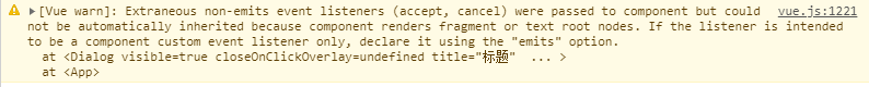
解决方法是添加
1 | export default { |
实现函数创建 Dialog 组件
借助 h 函数来实现
1 | import Dialog from './Dialog.vue'; |
实现 Tabs 组件
如何保证 Tabs 插槽中的组件是 Tab 组件
获取插槽中的元素并判断
1 | const defaults = context.slots.default(); |
获取选中元素的DOM来设置提示符的长度
在 v-for 里使用 ref 绑定一个函数来更灵活地确定要监听的 dom 元素
1 | <div class="color-tabs-nav-item" v-for="(t,index) in titles" |
设置提示符的长度和位置与 title 一致,这里 watchEffect 要在 onMounted 中调用,因为用到了 DOM。
1 | onMounted(() => { |
解决动态组件不更新的问题
尤雨溪亲自回复了这个Issue,解决方法很简单。加上 key 即可
1 | <component :is="current" :key="current.props.title"/> |