完善和部署项目
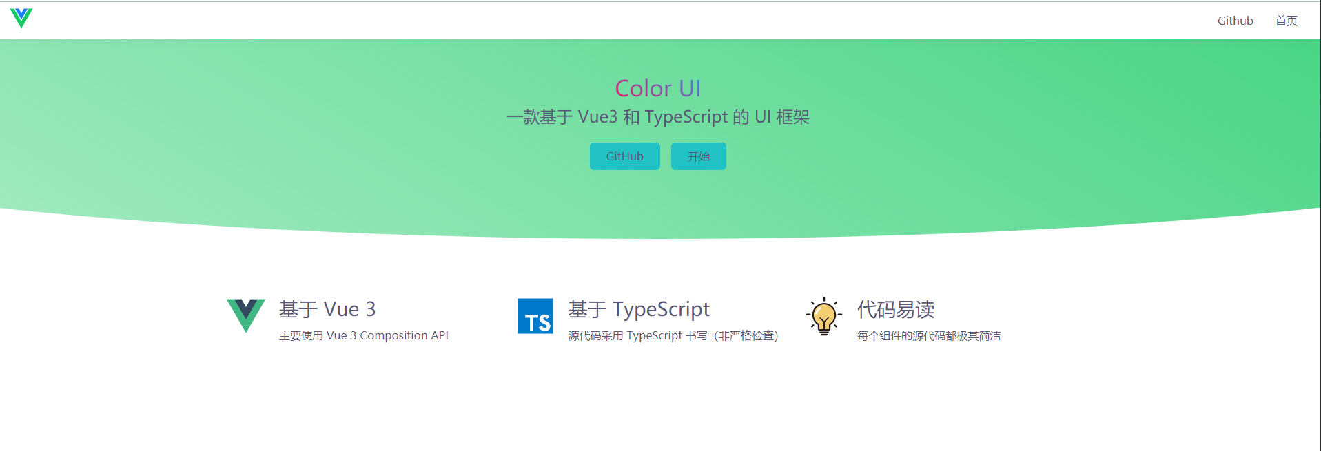
编写文档首页
程序员不懂设计,直接从一些设计网站上获取素材。比如 dribbble
主要做了以下内容
- 使用 cssgradient.io 这个网站制作了渐变背景和标题字的镂空渐变效果
- 使用 iconfont 引入必要的 svg icon
- 使用 clip-path 画圆弧
- 使用媒体查询实现响应式页面
实现的效果如下
使用 markdown 编写文档内容
自制 Vite 插件
首先需要支持 import markdown 文件,新建 vite.config.ts
1
2
3
4
5
6
| import { md } from './plugins/md'
import fs from 'fs'
import { baseParse } from '@vue/compiler-core'
export default {
plugins: [md()]
}
|
新建 plugins 目录和 md.ts
1
2
3
4
5
6
7
8
9
10
11
12
13
14
15
16
17
18
19
20
21
22
23
24
25
26
27
28
29
| import path from 'path'
import fs from 'fs'
import marked from 'marked'
const mdToJs = str => {
const content = JSON.stringify(marked(str))
return `export default ${content}`
}
export function md() {
return {
configureServer: [
async ({ app }) => {
app.use(async (ctx, next) => {
if (ctx.path.endsWith('.md')) {
ctx.type = 'js'
const filePath = path.join(process.cwd(), ctx.path)
ctx.body = mdToJs(fs.readFileSync(filePath).toString())
} else {
await next()
}
})
},
],
transforms: [{
test: context => context.path.endsWith('.md'),
transform: ({ code }) => mdToJs(code)
}]
}
}
|
引入 github-markdown-css 渲染 markdown 解析后的样式,然后在需要用的地方加上类名 markdown-body
创建 Demo 组件
使用 vue-loader 的 Custom Blocks 获取源代码
1
2
3
4
5
6
7
8
9
10
11
12
13
14
15
16
17
18
19
|
export default {
...
vueCustomBlockTransforms: {
demo: (options) => {
const { path } = options
const file = fs.readFileSync(path).toString()
const parsed = baseParse(file).children.find(n => n.tag === 'demo')
const title = parsed.children[0].content
const main = file.split(parsed.loc.source).join('').trim()
return `export default function (Component) {
Component.__sourceCode = ${
JSON.stringify(main)
}
Component.__sourceCodeTitle = ${JSON.stringify(title)}
}`.trim()
}
}
};
|
支持代码高亮
首先安装 prismjs,然后选择一个喜欢的配色
1
2
3
| import 'prismjs';
import 'prismjs/themes/prism-tomorrow.css';
const Prism = (window as any).Prism;
|
代码部分
1
| <pre class="language-html" v-html="html" />
|
这里的 html 通过计算获得
1
2
3
4
5
6
7
| const html = computed(() => {
return Prism.highlight(
props.component.__sourceCode,
Prism.languages.html,
"html"
);
});
|
支持代码展开折叠的动画
给代码部分套上一层 div ,根据折叠与否来选择赋予这层 div demo-code的高度
1
2
3
4
5
| <div class="demo-code-wrapper" :style="{height:computedHeight + 'px'}">
<div class="demo-code" ref="demoCode">
<pre class="language-html" v-html="html"/>
</div>
</div>
|
并设置样式
1
2
3
4
| .demo-code-wrapper {
transition: all .2s;
overflow: hidden;
}
|
TS部分
1
2
3
4
5
6
7
8
9
10
11
12
13
14
15
16
| let codeHeight = 0;
const codeVisible = ref(false);
const computedHeight = ref(0);
const toggleCode = () => {
codeVisible.value = !codeVisible.value;
computedHeight.value = codeVisible.value ? codeHeight : 0;
};
onMounted(() => watchEffect(() => {
if (demoCode.value) {
const {
height
} = demoCode.value.getBoundingClientRect();
codeHeight = height;
}
}));
|
解决部署 GitHub 失败的问题
在 vite.config.ts 中设置
1
2
3
4
| export default {
base:'./',
assetsDir:'assets'
}
|
rollup 编译库文件
新建 src/lib/index.ts
1
2
3
4
5
| import "./color.scss";
export {default as Switch} from './Switch';
export {default as Button} from './Button';
export {default as Tabs} from './Tabs';
export {default as Dialog} from './Dialog';
|
根目录创建 rollup.config.js
1
2
3
4
5
6
7
8
9
10
11
12
13
14
15
16
17
18
19
20
21
22
23
24
25
26
27
28
29
| import esbuild from 'rollup-plugin-esbuild';
import vue from 'rollup-plugin-vue';
import less from 'rollup-plugin-scss';
import dartSass from 'sass';
import {terser} from 'rollup-plugin-terser';
export default {
input: 'src/lib/index.ts',
output: [
{
globals: {
vue: 'Vue',
},
name: 'color-ui',
file: 'package/lib/color-ui.js',
format: 'umd',
plugins: [terser()],
}],
plugins: [
less({include: /\.scss$/, less: dartSass}),
esbuild({
include: /\.[jt]s$/,
minify: process.env.NODE_ENV === 'production',
target: 'es2015',
}),
vue({
include: /\.vue$/,
}),
],
};
|
rollup 编译
npm 发布
切换到 npm 源
更新 package.json
1
2
3
4
5
6
| {
"name": "@lichen404/color-ui",
"version": "0.0.1",
"files": ["package/lib/*"],
"main": "package/lib/color-ui.js"
}
|
执行 npm publish
完善项目
添加路由切换过渡效果
vue-router 4 版本对路由过渡的动效写法做了更新,旧的写法是不能生效的
1
2
3
4
5
| <router-view v-slot="{Component}">
<transition name="router-switch" appear mode="out-in">
<component :is="Component"/>
</transition>
</router-view>
|
完善侧边导航栏组件
侧边导航栏在移动端自动隐藏并添加过渡动画
1
2
3
4
5
6
7
8
9
| .sidebar-wrapper {
@media (max-width: 720px) {
position: fixed;
top: 54px;
left: 0;
transition:transform .2s;
transform: translateX(-100%);
}
}
|
参照 Vue 文档实现移动端展开侧边栏后,添加全局的遮罩,点击遮罩后关闭侧边栏
1
2
3
4
5
6
7
8
9
10
| .aside-open {
> .aside-mask {
display:block;
width:100vw;
height:100vh;
position:fixed;
top:0;
left:0;
}
}
|
1
2
3
4
| <div class="sidebar-wrapper" :class="{'aside-open':menuVisible}">
<div class="aside-mask" @click="closeMenu"/>
...
</div>
|
同时在路由切换时也会将菜单关闭
1
2
3
4
5
6
7
8
|
setup() {
const menuVisible = ref(false);
provide('menuVisible', menuVisible);
router.afterEach(() => {
menuVisible.value = false;
});
}
|
组件支持配置主题色
组件库改为使用 Vue.use 的方式引入,这样的话我们可以写一个 install 的方法。引入组件的同时设置全局的 css 变量。
1
2
3
4
5
6
7
8
9
10
11
12
13
14
15
16
17
18
| export default {
install: (app, options) => {
app.component('Tabs', Tabs);
app.component('Tab', Tab);
app.component('Dialog', Dialog);
app.component('Button', Button);
app.component('Switch', Switch);
app.config.globalProperties.$dialog = openDialog;
const {colors} = options;
if (colors) {
for (const color in colors) {
if (colors.hasOwnProperty(color)) {
document.documentElement.style.setProperty(`--color-${color}`, colors[color]);
}
}
}
}
};
|
使用
1
2
3
4
5
6
7
8
9
10
| app.use(colorUI, {
colors: {
primary: '25,128,255',
danger: '255,71,87',
success: '70,201,58',
dark: '30,30,30',
warning: '255,186,0'
}
})
|
1
2
3
4
| <Button color="success">Success</Button>
<Button color="danger">Danger</Button>
<Button color="warning">Warning</Button>
<Button color="dark">Dark</Button>
|
然后在每个组件中定义好每个颜色的样式,SCSS 可以减少很多重复
1
2
3
4
5
6
7
8
9
10
11
12
13
14
15
16
17
18
19
20
21
22
23
24
25
26
| &.filled {
@mixin style($color){
background: rgb(var($color));
&:hover {
box-shadow: 0 8px 24px -8px rgb(var($color));
}
}
&.color-primary {
@include style(--color-primary)
}
&.color-danger {
@include style(--color-danger)
}
&.color-success {
@include style(--color-success)
}
&.color-dark {
@include style(--color-dark)
}
&.color-light {
@include style(--color-light)
}
&.color-warning {
@include style(--color-warning)
}
}
|
添加 Dialog 组件的弹出关闭动画
Dialog 组件的弹出关闭的动画要设置在 v-if 元素的子元素上
1
2
3
4
5
6
7
8
9
10
| <transition name="dialog">
<div v-if="visible">
<div class="color-dialog-overlay" @click="onClickOverlay"></div>
<div class="color-dialog-wrapper">
<div class="color-dialog">
...
</div>
</div>
</div>
</transition>
|
样式要写成下面这样,否则过渡效果不生效或者关闭的时候没有过渡效果,很玄学。
1
2
3
4
5
6
7
8
9
10
11
| .dialog-enter-from .color-dialog, .dialog-leave-to .color-dialog {
transform: scale(.8);
opacity: 0;
}
.dialog-leave-active, .dialog-enter-active {
transition: all .2s;
}
.color-dialog {
transition:all .2s;
}
|